It's not the most eye-grabbing of designs (save for the loud fonts which I really admire) and the most interesting of copies but the mere fact that it mentions logos (slash, something which aligns to my marketing and design fancy) was enough for me to Google some more. It turned out to be a movie poster for an award-winning short film called - you guessed it - Logorama.
Watch, watch!
Logorama takes us on a bustling metropolitan complex which strikes close to home than any other - a home filled with all the logos that we've grown to love and/or hate. The message which comes across to viewers are not hard to miss but pretty hard to swallow: the familiarity it evokes stems from the fact that it closely resembles how we have come to trudge though our daily routine with nary a conscious thought on how logos have manage to invade our lives in the most blatantly saturated manner. Ever wondered how the term "cutting through clutter" came about? Logorama answers that by showing you exactly how this specific city in the limelight wades through the astounding amount of brands which, creepily, we all would have happily exclaimed we know even with the slightest snapshot as the camera pans.
We've all been there while we watched Logorama, our eyes on the constant move trying to decipher the logos that flash before us. "Oh, the Michelin guy! Did I just see The North Face there? What is up with those MSN butterflies?" (If you need a hint or two, check out this list of logos which appeared in the film) When once we've convinced ourselves that we've managed to shut ourselves out from brands, suddenly, a film like Logorama comes about and we see ourselves on the lookout for those which we thought we've already ignored. If I may borrow from The Design Observer Group's Adrian Shaughnessy's take on Logorama, "product placements [take] center stage". And, rightly so.
Center stage has its perks, certainly, but Logorama dabbles on this long enough to take the idea away from both marketer and consumer as its story concludes on the most simple yet terrifying end - the megacity in ruins.
And, with a film seemingly running on premonition, who would have thought that certain scenes would unravel and we'd be stuck on the same rut Big Boy and Esso Girl were in: lounging in our own little island, indulging on Apples, and watching as an uncontrollable oil spill destroys the city. I bet you missed the BP logo near the end like I almost did.
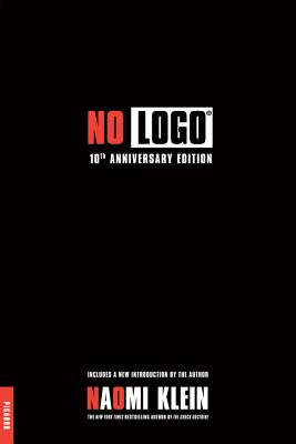
At any rate, (and at the risk of being anticlimactic just because of the sudden need to cap it all off immediately) the poster's color combination just reminds me of a logo-related book by Naomi Klein.
Is it just me or the propaganda against logos have taken red and black as their advocacy's color of choice?
Photo Credits:
[.]Logorama Movie Poster in Logorama wins Oscar for best animated short film by TheLogoFactory
No comments:
Post a Comment